A thriller is a type of film that typically creates tension and suspense in the audience, holding interest through certain techniques that I am going to discuss in this evaluation.
Enigma is probably the most common and effective technique used in any thriller product. Enigma is the word given to anything that raises questions amongst the audience about the narrative, an example of this would be if we are shown a character, but are not told or shown anything about them; Enigma would be raised as we begin to question their identity. Another example of enigma, in the film ‘Seven’ during the title sequence, we see a character writing and cutting the skin off of his finger tips, we never see his face, which makes us question his identity and whether he is a Protagonist or Antagonist. In our final product we have created enigma in various ways –
· Haven’t shown any faces, raising questions about his identity.
· Clashing soundtrack, raising questions about the genre and mood.
· No establishing shots are used, so questions are raised about where the characters are in relation to each other.
· Opening shot of a man on the ground raises questions like – who is he? Is he alright? What’s happened to him? Etc...
Another technique used in thriller products is Restricted and Unrestricted narrative. Restricted narrative is an effective way of creating enigma, as we are limited as to what we see in the frame, we don’t have a full understanding of what is going on. This creates tension and suspense as the audience doesn’t know what’s going to happen next. For example in the short film ‘Joyride’ – a character was locked in the boot and the camera stayed in the boot with him, the narrative outside was restricted, so the viewer wouldn’t know what’s going on outside creating tension and an urge to keep watching. We have incorporated restricted narrative into our final product when the Antagonist is on screen, we used close ups so the audience doesn’t know where he is or what his surroundings are like. Another use of restricted narrative is where we have kept the antagonists identity relatively hidden by not showing their face.
In our product, we have covered various aspects of mise en scene.
· Costume - The antagonist is wearing black which typically represents evil; this was our way of expressing that he is a bad person without giving too much away.
· Setting – Typical house showing that the protagonist is just an average person during his daily routine
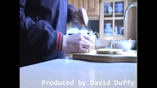
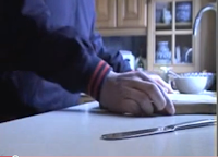
· Props – The knife in the foreground of the medium long shot where the protagonist is buttering some bread is used to reflect the antagonist, as the knife is the only object that is in focus in the frame showing that the killer is in killer even though he isn’t in the house with the protagonist.
· Lighting and colour – in our group, I raised the idea that we should use low key lighting when the Antagonist is on screen so that the flicking between the two characters was clear, my fellow group members didn’t agree with this so we kept the lighting the same throughout, not showing a clear separation between the two characters, which may raise enigma in the audience, as this way it is unclear who is the protagonist and who is the antagonist in the frame.
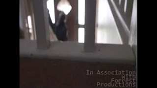
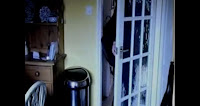
We used various camera techniques and angles in our product. We used a high angle showing the protagonist leaving the house, the camera was placed so that you could see the character through the banisters, giving the idea that he is being watched by someone. We also change the depth of field in this shot, as we go from focusing in on the banisters to focusing in on the character, showing that someone is focusing on him and is watching him for some reason, which again creates enigma.
We did discuss the three stages of narrative as a group, but we came to the conclusion that if we involved all 3 stages, this thriller opening would appear as more of a short film, so we based the opening around ‘the set up’, showing both the antagonist and protagonist going about their routine before the inevitable ‘confrontation’ that would take place later on in the film.
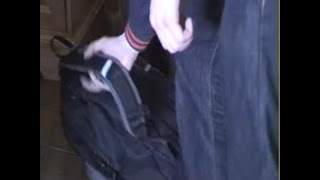
It is clear that the protagonist in the picture is a student of some sort suggesting he is in his late teens, we understand this because he is shown picking up his rucksack, which is a typical prop used to express a younger age. The use of a younger character can suggest vulnerability due to immaturity, size and experience. In most films where people are victimised, the victims are usually teenagers, for example in films like ‘Nightmare on Elm Street’, ‘Friday the 13th’ and ‘The Texas Chainsaw Massacre’. Teenagers are used as the victims because the films are aimed at a teenage audience, if the victims in the picture are of the same social group as the viewers, more tension will be raised as the audience will begin to think whether such a thing could happen to them in real life. It was hard to show a specific social group in our product as we didn’t really show much of the characters, the whole sequence was based around extreme close ups of objects such as light switches, a kettle, a knife, and a cup being filled with water, through the use of this, the narrative was restricted leaving any form of social group relatively hidden.
As a group, we discussed and researched which company/institution we would approach to distribute our film; we discovered that Alfred Hitchcock’s film ‘Vertigo’ was distributed by Paramount Pictures, due to the success and popularity of that film we decided that this would be the institution for us. Paramount Pictures is well known for distributing huge blockbuster films all over the globe, for example ‘Shrek’. We could also look into internet broadcasting and have the film streamed over the internet, meaning it is easily accessible for the viewer, which may draw more interest. Another way of making the film easily accessible at home is getting in contact with companies such as Sky and Virgin, and give them the rights to have the film played over their channels on the television so the viewer wouldn’t have to leave their home to watch it.
The target audience would be teenagers, as the victim in our film is a teenager. The audience would be able to relate to the victim as they are the same age, which would create more tension. An example of another thriller film that this target audience would enjoy is ‘Donkey Punch’ due to the late teens/early twenties cast making it easy to create a bond between the viewer and character.
I have learnt a lot constructing this product. I learnt how the basics to using a camera, for example even something as simple as setting the white balance, before we started this project I had no idea how important this was. I also learnt how to change the depth of field whilst filming which proved helpful as it added a nice effect to one of the shots in our final product. I learnt how to use iMovie and Final Cut. I learnt how to incorporate titles into a moving frame, and I learnt how to use fade in and fade outs effectively, compared to our work on our preliminary, our work on the hardware side of things was much more advanced.
If we compare our final product to our preliminary task, I believe we have advanced immensely, we have used much more camera techniques, such as use of depth of field and hard focus, and we were also tighter with the white balance issue, so that all the shots were the same colour tone. I believe editing ran a lot smoother this time as we managed our time appropriately to the task in hand. I believe the narrative in our new thriller was much better than the preliminary, as our first effort didn’t really create suspense in the way we wanted it to. When all of this is taken into account, I believe we have created an effective opening sequence that raises enigma appropriately and keeps the audience intrigued as to what happens later on in the film.
Health and Safety considerations:
Lighting:
When using either the red heads or the portable lights we must make sure that any waires are taped up and that the lights themselves are on a stable base as so thay do not fall and cause injury. GLoves will be used when handling these lights, especially when they are turned on to avoid buring
Props:
As we are planning to use knives in our film we must make sure that we handle them with care, especially around other people
Trains:
We are going to be filming at a train station so we must take obvious precautions to not endanger ourselves or other people that may be at the station
Synopsis of Thriller opening - David, Chris and Jamie
We want to keep the story of our thriller opening simple, but we also wish to make the veiwer want to carry on watching the rest of the film. We will do this through raising Enigma codes and use of restricted narrative.
The plot of our thriller will be based on a phycotic murderer who is pursuing a victim. We will base this in a village and the targeted victim will be at a train station when the attackes choses to strike. The victim is then taken back to a house where he is gagged and knocked out by the murderer, with the use of knives the killer will kill people from his list of targets. The list is kept in the form of pictures.
The film starts whilst the victim is on the floor of his house, there will then be a flashback and the story will follow from there.
Friday, 30 April 2010
Thursday, 29 April 2010
Se7en title sequence analysis - David Duffy
- We see extreme close ups, this provokes enigma due to the fact that this is possibly the killer and we cannot see everything that he is doing. This will frustrate the audience and will create closed narration.
- The various things that the antagonist does on screen are disturbing eg cutting his skin off, and this will raise the question to the audience as to why he is doing this
- The non-diegetic sound of the music has a very uneven and uncertain tone. This keeps the audience on edge as they will not know what is coming next
- The text used o the titles are interchanging and are constantly moving to represent the uncertainty of the situation and the killer. The colour of the text is grey, connoting misery and death
- The text is related to the narrative of the film but does not interfere with the actual actions on screen
- We are given a frustratingly short time to view the antagonist’s setting, the codes that could hold many answers to the later part of the narrative, this frustrates the audience and is use of closed narration
- The setting seems, dark, dank and the colours of the props around the character are all of blacks, greys ect, all of these could be seen as connoting death
- Also precision of tool usage is important in representing the character traits of the antagonist, shows how calm and calculated he his. but at the same time the pictures we are shown on his table and the music that is played shows how perhaps he is ready to snap
Blog Problems - David Duffy
- Some of the title sequence analysis's that were done months ago have not published, and it looks like i will have to redo them as i cant copy and paste the text either. Although only a few peices of work appear to be missing.
Tuesday, 20 April 2010
David Duffy Evaluation
How does our product either meets up to or challenges these conventions?
Right from the start of our planning we agreed that we would be basing the story of our film ‘The List’ around two characters. A protagonist and a villain, partly as we were only allowed to use two minutes of footage but also as we wanted to keep it simple and not confuse the audience in the beginning.
We first tried to disturb the viewer by having the first shot of a man unconscious on the ground, this was intended to create early enigma, for example, who is he? What is he doing on the floor? Is he dead?
After this point we disrupt the linear order of events using a flashback transicion to go back in time. The idea would be that if we were to finish a whole film then we would come back to this point.
The idea behind the light switch shot is that the character is metaphorically ‘turning on’ the story.
We did try to follow the traditional three act structure briefly by establishing a set up, this shows the protagonist in his everyday life, before the incident in the first scene. We show him doing mundane tasks with extreme close ups. Also in the set up we see that the antagonist (bottom right) is preparing as well, this could be seen as a mini-disruption to the plot
Although it was hard for us to focus on anything beyond the set up as we did not want to turn this opening into a short film. At some during the rest of film, pretty soon after the start in fact, we would have a confrontation between both the protagonist and the antagonist. But as it turned out we did not have enough time to feature the disruption in the plot, we had to create tension and suspense in other ways.
One of the best ension films (in my opinion) is Vertigo by Afred Hitchcock, heres a link to its IMBD page http://www.imdb.com/title/tt0052357/ Also one should look up 'The Birds' also by Hitchcock.
Vertigo, starring James Stewart, is a work of genius as Hitchcock has the audience in the palm of his hand throughout due to the facinating nature of the story and plot. If we had been able to film the rest of our thriller then we would have certainly drawn a lot of inspiration from Hitchcock's work.
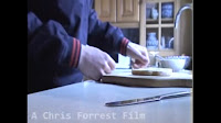
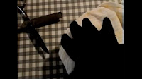
We tried to create lots of enigma in a variety of ways, one of which was through using restricted narration to frustrate the viewer. We used this throughout the film such as when both characters are preparing for different things, you hardly see the protagonist’s (left) face and you never see the antagonist’s (right) face.
.bmp)
.bmp)
We also restrict the audiences view of things by having certain shots with different depth of field, we used shallow depth of field in a few of our shots, but we used full focus shots for the most part of our film. We also used depth of field to draw the viewer’s attention from one part of the frame to the other. This was especially useful when we were making our titles.
.bmp)
In this Particular long shot (above), the camera is placed behind some wooden bars. This gives the immpression that someone is watching him and is peering through these bars.
Taxi driver provided us with a good example of how shallow depth of field can be used, this is the title sequence of the film so it was doubly appropriate. Although the effect was difficult to duplicate as we had to use a camera with manual focus, this meant that was much harder to shoot a static shot when you are having to use on of your hands to turn the focus on/off.
Character
As we only had two minutes, it was important for us to try and establish the key characters and their traits straight away. The protagonist after first being shown on the floor has a flashback to earlier that day. We show some of his morning ritual to show to the audience that he is intended to be a ‘normal’ guy. Through the use of gentle, everyday, props such as butter ect and through the use of setting. The setting is my house and does not bear any disturbing qualities.
A similair setting was used in Se7en, where Morgan Freeman's character is preparing for his day, but in a fashion that does not provoke anything sinister.
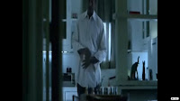.bmp) http://www.youtube.com/watch?v=Z-u3fQOOZ34
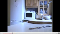
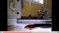
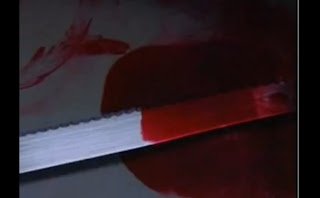
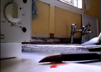
http://www.youtube.com/watch?v=Z-u3fQOOZ34The setting and props used for the antagonist on the other hand are supposed to unnerve the viewer as he is living in a ‘grimy’ location. There is an obvious use of iconography within the scene at the antagonist’s home; the large kitchen knife stained with blood is meant to present this character as dangerous. One may notice that this particular medium close up shot is almost opposite to another shot earlier in the sequence.
.bmp)
.bmp)
The butter knife belonging to the protagonist on the left is supposed to suggest that he is calm and harmless, where as the large, sharp kitchen blade on the right is supposed to make it obvious to the viewer that he is dangerous and disturbed. The blood also helps to create this sense.
Even the colours of their clothes can help to put a picture of the character’s personality together, the antagonist wears dark black clothes eg gloves for the most part of the sequence. The protagonist wears normal, not to bright, but clothing that wouldn’t suggest anything sinister about this person
Lighting
It was difficult for us to use lighting to our advantage, we found that once college had finished we were rushed to get filing done before it went dark, however this wasn’t a problem when we filmed at weekends.
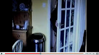
We used mostly high key lighting, especially for the shots within the protagonist’s house to signify his sense of transparency and innocence. Although low key lighting was used in one medium shot in which the character switches off the light and walks out the kitchen door.
.bmp)
Lighting is probably something that we should have made more use of, if we had made more use of the red head lights we may have had more option of shooting slightly later in the evening, it also would have added more quality to our product.
Camera Movement and shots
We were very particular of our camera movement. Throughout the sequence we used many close ups and extreme close ups.
This helped us to create more closed narration as we are restricting the audience’s view, and to in turn also create enigma. It was also useful for making our titles as we found that we could blend the titles into the narrative (although without disturbing the plot). We actually made it so the titles moved with the characters at certian points.
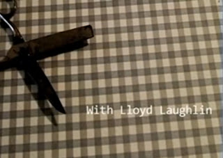.bmp)
One of my favourite shots within our film was the use of a canted camera mid-way through the film, it gave us space for some titles and it worked well in our sequence. A canted camera angle was subtle.
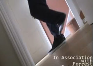.bmp)
For most of our shots the camera was static, but for some of the extreme close ups we used freehand camera. This made a slightly jolty movement which we think creates a sense of urgency about this man’s movements.
At the beginning of the sequence we had a montage of close ups one after the other. This quickly builds up some tension and also creates a sense of urgency within the film. This was inspired from the film 'Shaun of the dead', even though this is not a thriller and is indeed a horror/comedy it was still useful for this short part of our film.
http://www.youtube.com/watch?v=Qj7F7ITFSd4 This is not the actual film but it creates a very similair effect.
.bmp)
.bmp)
This idea was inspired by the montage of close ups during the title sequence of the film se7en. The use of extreme close ups shows the disturbing nature of the character, it also creates closed narration through restricting the audiences view of the killer and therefore creating enigma.
You can see the full title sequence for se7en at youtube: http://www.youtube.com/watch?v=yALjuJcfg90
The final shot in our sequence is after the main title appears. After the wors 'The List' fade away a fast moving train appears at the end, this was intended to shock the audience and to simply keep them on edge.
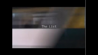.bmp)
Sound
We wanted to make use of an ambiant soundtrack or some music that would run throughout the most part of our film. We eventually decided that using this light-hearted jazzy type music would be appropriate. We thought that having the tones from the music contradict the ones from the images would provoke curiosity from the audience. The music seems to fit at the beginning of the extract as the protagonist isn’t doing anything sinister or out of the ordinary, it makes it seem as if the protagonist is oblivious to any possible danger.
A similar technique was used at the beginning of the film ‘Misery’ in which the protagonist is listening to Moetown music whilst driving perilously on the side of a mountain.
www.youtube.com/watch?v=Cgqu2w3Ore4
We also faded out the music once the setting had changed so that it was only very faint in the background, we used this to help establish a different place in the film.
We also faded out the music once the setting had changed so that it was only very faint in the background, we used this to help establish a different place in the film.
How does your media product represent particular social groups?
In truth it is hard to establish any kind of social group at first glance at our product as we see so little of the character’s faces. The main focus is on the actions in the thriller opening.
But that does not say, however that this film would not have gone onto to represent particular social groups, in particular a slightly younger group of people, (possibly aged around early twenties, late teens) this group is represented through the items of the protagonist. He holds a rucksack; this is an obvious symbol of a student or a young person off to work.
.bmp)
We used this social group because we knew that it would relate better to our class audience. It is also highlighting the possible vulnerability that people sometimes associate with young people wondering on their own. So this film is not just aimed at young people but also an older audience as well as this will relate to parents who have children who live alone. Obviously we are not suggesting that parents should not let their children leave the house but it would hopefully unsettle any adults watching the entire film to create the tension required to make it a climactic thriller.
Programs like ‘Skins’ have been building up stereotypes and different characters of young people in the UK, we would hopefully play off this generation for our film. If we were to complete the whole film, the representation of woman would be modern. This is because that the traditional representation is now inaccurate and doesn’t really apply to society today. Also modern woman in TV or films are more complex characters to show and are therefore more interesting. A modern woman may be seen as strong, independent and self-reliant. Whereas the traditional representation would be the exact opposite of all of those features. Although it is hard to back this speculation with evidence because we have only featured two characters in the opening to our thriller.
Although with the music we have used, it is hard to relate this to a young adult audience. The slightly jazzy piano music would perhaps attract a more matured veiwer, but this film is full of contrasts. The music may even link directly to either of the two characters; it could reflect the protagonist’s personality of being calm, couls suggest to the veiwer that he is too careless.
.bmp)
The protagonist’s clothes are not supposed to provoke anything in particular as he is wearing normal clothing (see above), this would hopefully make the audience accept him as a normal person. This makes the situation all the more sinister as one would have to ask what does this man have to do with a dangerous and psychotic person in the other setting of the thriller. But despite attempting to present this man as young, we also wanted to create some form of suspicion as we used so many extreme close up shots to try and make the audience feel untrustworthy of this person.
.bmp)
At the same time the protagonist character would challenge the normal common ideas of the young British male stereotype. Also, we planned to use women characters in a way that would not show them as victims, but counterparts to the main protagonist. It has become common for female characters to play just victims where their binary opposite is masculine.
So overall we are trying not to conform to the common thriller conventions. We see this usage of the stereotypical women victim character in many of Hitchcock’s works such as Vertigo where Kim Novak’s character is vulnerable and requires the male character played by James Stewart to protect her. Hitchcock constantly used women, particularly blonde, to play similar roles. But this is not to say however that his characters were so traditionally based.
(James Stewart and Kim Novak in Vertigo) 
For the antagonist, it is hard to relate this man to a particular social group; the film focuses more on the social groups that he targets for victims.
What kind of Media Institution might distribute your Media product and why?
We would hope that our film would fit into the category of a blockbuster film. By this we mean that we want to distribute the film via the usage of major companies for instance New Line Cinema.
The company that we would most like to go through would be Paramount Pictures. We would chose this company because they have an excellent history of producing many excellent films and in particular thriller ones. Perhaps the most famous director of all time, Alfred Hitchcock, had his film ‘Vertigo’ was first distributed through Paramount. They are one of the world’s leading distributers in film and their recent profits have been on the rise. They also have a great online film community which could be used to tell people of our film through the use of forums ect.
We would of course give Paramount licensing rights in order to help distribute the film as much people as possible. But there are certain measure that we could take ourselves for instance we could use Facebook, Twitter and Myspace fairly cheaply
Another film which Paramount distribute is ‘Shutter Island’ which is a recent thriller starring Leonardo de Caprio, the themes and tones created in this film reflect the aims of ours.
But most importantly is that they have links and influence across the entire film industry, having business links with the likes of DreamWorks ect, so they would be able to get our film the most publicity and also get it across the entire industry.
We would want to take full advantage of the newest innovations in distribution, such as the usage of digital distribution; Paramount even has their own Digital Distribution section of their website.
However we may also look to do a deal with a major video games distributer such as Microsoft and Sony. We would not preferably to a deal with Nintendo because they have a too younger audience. We would hopefully be able to post small clips and trailers of our film onto the main pages of people’s games consoles. I know this to be effective as we can see this with the ‘Lynx Twist’ short films on the Xbox 360.
Obviously we would want to put our prints into as many big cinemas across the UK, so that this would be a high concept film, if we were to get the help of Paramount Pictures then we could easily.
We hopefully use the obvious routes of advertising to remind every person of our film. These would include TV trailers, Internet ads (on the side of certain websites), also posters and billboards in dense cities where there is a big film community. And also we would hope to exploit the ‘Videos on Demand’, such as Sky movies once the film is out. But of course these costs would have to be met by Paramount Pictures.
Who would be the audience for your media product?
There would be no particular gender target audience for our film, despite the main characters being men. Our film would also be rated a 15 as it will contain content that is intended to disturb the veiwer but there isn’t a big use of graphical content and gore. We aim to be more subtle about our film.
Even though the age certificate would be 15, the target audience would be anything from 15 + as when it comes to thrillers; they have a much broader market appeal then say a period drama like Pride and Prejudice. However we would expect that a slightly younger audience may be more drawn to it because of the young age of the characters on screen.
I personally asked many people who watched our film, and enjoyed it, as to what was their favourite thriller at the moment. 70% of those people said ‘Shutter Island’.
When i asked the same people when given a choice of: Vertigo, Memento, Se7en or The Birds – 60% of them said that they preferred either Se7en or Memento.
These people are students from my college and it is clear that they prefer the more modern films such as ‘Memento’ rather than the old classics such as ‘Vertigo’. This is good because these are the kind of films that we are trying to emulate.
What have you learnt about technologies from the process of constructing this product?
List:
HDV 1080i r mini DV
Camera tripod
Red-Head Light
Light tripod
Also Mac computers with:
Final cut pro
Imovie HD
Garage Band
We learnt vast amounts as a group about the various equipment that we used. We were very lucky to be able to use the HD cameras available; this allowed us to tamper with the depth of field far easier because of the option of a manual zoom. The quality of the camera was also outstanding, especially when compared with the smaller cameras. Also the sound that was picked up was of much higher quality because of the very sensitive mike on the camera.
We made the first usage of the red head lights for filming our sequence and it certainly helped to duplicate the light of day during the evening. This was especially useful as we filmed in the winter, where it got dark very quickly after college so we had limited time to film; the light meant that we could film for longer without the darkness having an effect.
In terms of safety, we had to be far more aware of the potential hazards as we had more equipment (and more expensive equipment for that matter) to use. We put sandbags over the tripod of the light so it would not tip, covered wires in duck tape and used gloves for when handling the light as it got hot after sustained usage.
Also, we have learnt about blogging through this media task. None of us within the group had ever used or made a blog before and it was an enjoyable new way to do coursework. It meant that we could get more creative. Although overall I do not believe that the blog has made this work any easier, in fact it has made it more complicated and strenuous. This is because the writing tool for the blog is useless as it is very annoying just to move a picture around. Not only that but the whole structure and spacing of an essay can randomly fall apart once you log off.
We all learnt bags of stuff about the usage of new software, especially Final Cut Pro and Garage Band. We used this for the most part of our editing and it was especially useful for creating our titles throughout the film. Final cut is more complicated and detailed then imovie, so this allowed us to use more complex methods to create an overall better film.
How did you attract your audience?
I believe that to make a modern successful thriller it has to be pact with enigma provoking shots. We see this in such films as Se7en, especially in the title sequence.
The veiwer has to ask questions at the very beginning of the film as to why there is a random man on the floor. We think that by using many extreme close ups we have limited the view of the audience and have created closed rather that open narration. We can see this in our thriller by watching the montage of close ups whilst the protagonist is in the kitchen, preparing for his day.
We tried not to use violence in the opening sequence because otherwise the veiwer would have thought that this violence would re-occur throughout the whole film. Btu we did, however, try to connote the previous and future usages of violence through the use of iconography. By placing knives in the camera shot stained with blood, the connotations to the veiwer are obvious. By not actually showing the knife being used, it will almost tease the veiwer.
.bmp)
In terms of story there is little to give away from the opening 2 minutes. However, the very first shot is very provocative as there is a random man on the ground. By using a flashback here we frustrate the veiwer by going back in time and not explaining why he is there straight away. I think that twists like these will attract a younger audience, interested in seeing something different.
We also attracted people by using depth of field. This proved to be a great way of creating closed narration by blurring and therefore restricting the audience’s view through. We continually used shallow depth of field.
.bmp)
The music for our film is curious for the audience, after seeing the disturbing opening scene and then the flashback, the audience will be worried when they see that the protagonist is playing jazzy, causal music and this suggests that he is unaware of his impending danger.
Assessing our effort and work
I believe that I put enough effort into our film to be recognised as a major contributor. I turned up to every filming and editing session and was also a contributor into the storyboard and the original ideas behind the film. However I could defiantly have been more organised throughout the process, despite always turning up I could of perhaps made more effort to organise filming and editing sessions. I also made mistakes when filming eg, forgetting the tape (although we borrowed some else’s) and actually forgetting to pick up the camera at the end of the day. However I am not a total idiot and these mistakes were not made more than once.
The main fault behind my organisational skills was that I didn’t recognise early enough when something went wrong with our blog. For example we were given the tasks of analysing 5 title sequences from other random thrillers, I completed the task but for some reason the blog failed to publish the posts. I only realised this until a day before the final deadline for the whole blog so it was frustrating knowing that this problem could have been avoided had I done a more thorough check on the blog posts earlier.
Jamie gave great input the whole way through the process, whether it be editing or filming. He was also especially good for the storyboard designing process. It was always going to be difficult to meet up outside of college because he lives in a different village, as does Chris. But this was rarely an evident problem as a know Jamie very well and can easily contact him at any time.
The same can be said for Chris as he too lives in a different village but still made the effort to meet up and stay in contact. Chris also made very creative inputs for the narrative of the film which helped to improve the quality. He also helped us to drop certain parts of the film that weren’t needed which helped us keep to our 2 minute time limit. At certain points during the whole process, Chris sometimes missed sessions due to illness, but he did make up for the absences by keeping track of what me and Jamie had done. These absences were also rare.
Peer Evaluations:
Good:
- Looks like a thriller
- Lighting is very good, separated each character well
- Confuses veiwer (in a good way)
- Knife in the sink especially effective shot
- Good use of iconography
- Music contrasts well with the images on screen
- Good titles and effects
- Good use of depth of field
- Enigma as to who the characters are
- identities not revealed – good enigma
- Good Mise en Scene for second character
- Music volume changes to show different settings
Bad:
- Music did not work well
- Shot of protagonist leaving, lighting was too bright
- Music made it seem like a Rom Com
- could be more effective with non-diegetic sound
What do you feel you have learned in the progression from the preliminary to the final product?
I think that we have made substantial progress in terms of quality from our old preliminary task to this one. I think that one of the main factors in this has been that we have been using better equipment and technology, as for the first attempt we only used Imovie. This meant that there was very basic use of continuity editing, however we did what we were asked to do in the preliminary tasks and our knowledge of final cut pro was next to nothing. Also we had a better quality camera for this thriller and we also actually made use of the red head lights.
Small details such as mistakes with the sound eg, we had some people talking in the background in one of them, made our preliminary task look shabby and rough around the edges. We have made a much better use of continuity editing in ‘The List’ as we have led the audience through far smoother than before. With the use of transitions such as fades the film seems to just to flow much better. However if it had not been for our preliminary task we probably would not have used such things like a parallel editing which we made a lot of use of in ‘The List’.
I think that we have also exploited the possibility of using depth of field in this thriller. And our overall use of shots to match the characters and to close off narration has been better. As it is an opening sequence we tried to use shots that would simply draw people, so we used very little medium shots so as to not seem mundane and we used many extreme close ups to restrict the veiwer and just to give a more dynamic approach the film.
We have also been more subtle about how we try to create character through props and mise enscene. For starts we avoided using hooded tops as that is a cliche and a cheap way to try and create a sinister antagonist. We kept facial shots on our opening to a minimum and included no dialogue, this isn't anything new as we never wanted to expose our poor acting capabilities.
I think that due to the better continuity editing we have led the audience smoothely though our film, especially with the use of parallel editing between the two characters. Even though it would have been good to show our knowledge of the 180 degrees rule, but that would mean using dialogue which we chose not to use.
I think that overall we have become more complex in the way that we think about creating thrillers, we used films such as 'Memento' to help give us ideas about how to construct a complicated narrative. With the help of better equipment and software we have made an overall better film in terms of camera work, mise en scene and narrative to make an effective thriller opening.
Monday, 19 April 2010
Jamie Hunnisett - Evaluation
-
A thriller needs to be able to obtain and keep hold of the audiences attention by using a fast paced story which creates suspense and tension throughout, so the audience are always on their toes. The genre is one in which producers can really explore and use all the techniques which are available to produce amazing films which are a mix of excitement and scares, a combination of feelings which make most people fascinated and enticed by what they see.When creating a thriller producers need to think of all the ways in which they can make sure they turn out a thriller which does just that.
To do this the producers need to create a sense of enigma, enigma code is when the film reveals part of the story, but leaves it unclear, so the audience are made to think about what may happen next, and are always asked constant questions. Enigma is a key technique used in thrillers because it is a great way of grabbing the attention of the viewers and creating tension. For example in our title sequence you cannot see any of the characters face's, so the viewer is wondering what they look like, who they are and what they are doing. It creates a sense of mystery, the viewer is never sure of the full identity of the characters.
The narrative of the story is very important, the narrative is a chain of events in a cause and effect relationship, occurring in time and space, and is not a random string of events. Producers include restricted narration and unrestricted narration to again make sure the viewer always has something to think about. When narration is restricted it means that the audience only have partial access to what is going on, this links to enigma, and in a thriller it makes it that much more exciting when you as a viewer do not quite understand something yourself, because you need to work something out, and feel involved. Unrestricted narration is obviously when you are told and shown everything that is happening, a mixture of the two maybe used, for example if there is a double plot to the film, the producers may want the viewers to understand one plot, and think they are fully aware of whats happening, but then later find that there is another part of the story. But this could just be included in restricted narration. We use this in our opening because we have two characters, so the audience see two different peoples daily routines. In other words, parallel editing. The narration is restricted because we haven't told the viewers exactly what they are doing.
Mise en scene is an important part of any genre and has many sub-categories which can be tailored specifically towards a typical thriller film. For example most films include an antagonist and a protagonist. An antagonist is a villain, an evil character who the audience will see as a threat to someone else, and the producers would try and make most of the feelings towards this character full of hate. In our clip we have tried to get across two different characters personalities early on. The antagonist is the character who we see in a darkened room cleaning a knife which is covered in blood. Obviously people will see this character as someone who has done something wrong, meaning subconsciously they have labeled him as the evil character already. Naturally if there is an antagonist then there will be a protagonist, which is the opposite. Someone who will be seen as the hero of the story, and most likely be the main character, in which the creators will try and make the viewers feel very attached to this character. The term 'Binary opposition' is used to describe when there is a rivalry between two characters.
Iconography is another part of mise en scene which is the use of say objects which are particularly related to the thriller genre. Iconography is used to make it clear what the genre is, or whether a character is good or bad. For example in a typical thriller we are likely to see guns and knives, and obviously if someone was holding either a gun or a knife, straight away we assume that character is going to do something bad or wrong. This links back to what i was just explaining. To make sure the viewers differentiate between the antagonist and protagonist, we used a classic thriller prop, the knife. This is a great example of using iconography to get across a characters personality.
The use of the camera and the type of shots in a film help a lot to determine a thriller film. The camera is a powerful tool and when used correctly it can help a lot when making a situation more scary and exciting. In thrillers we are most likely to see close up shots in quick succession to create a more high paced scene, or we see shots which are long and out of focus, to build more tension. Camera shots together with sound are crucial to building up tension. If fast paced high tone music is used then it disturbs the viewer and keeps them on edge. Also sound can help give the audience an idea to whether something key to the story is about to happen, by building up volume and intensity. However in our opening we have used a rather upbeat jazz melody. This is deliberate because it contradicts the typical eery thriller music, and creates a sense of irony.
Common thriller themes and topics may include things like chase scenes, where a protagonist is trying to flee from an antagonist hunting them down. Or where the protagonist works to try and resolve problems which they are confronted with in the narrative.
-
In our media product we have two main characters, and the way in which these two characters are represented is very important. The protagonist in our sequence is a young male teenager, so we needed to make sure he came across innocent and careless. This also helps with him being the protagonist and the victim, because he is oblivious to what is going to happen. The clothes he is wearing suggests he is young and doesn't have a job, he isn't in a suit or anything because this would make people think he was working class. Although, we see him alone in a house, preparing his own food and getting ready to go out, suggesting he does have some independence, and is old enough to get himself in to some risky situations. Obviously in the sequence we do not see his face, and facial expression is a key part in representation, because we can read whether the character is very serious and masculine, or young and inquisitive.
The rooms in which the protagonist is featured in are all very well lit, which again suggests innocence, as darkened rooms usually connote something evil or sad. The activities that the character is partaking in are very 'everyday' for example getting a drink, putting on his shoes and bag etc. this again helps define whether the character is the protagonist or not because he isn't seen doing anything which could be related to a typical thriller topic. Unlike the other character who is cleaning up from what looks like his last attack. We have tried to make the protagonist represent young people in a positive way because we have found that in most media wether it be newspapers, magazines or the TV news channels young people are represented in a negative way. We have made sure the character does not fit the stereotypical teenage figure we have been lead to believe today, a young person is now seen to be lazy, rude and are up to no good, this is down to the media. By creating a positive image of young people it helps us target the younger audience, and i believe that thrillers are mostly viewed by people from the age of 16 to 22.
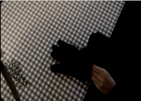
The other character in our media product very much contradicts the other. We have a man who is around 20 years old, so a bit more mature than the other. However this man is made to look very suspicious. He is wearing all black, whereas the other character was wearing brighter clothing, this suggests evil and creates the sense of mystery. We see less of this character, infact we only really see his black gloves, this helps to reinforce the fact that he is up to no good, making sure his hands are covered, meaning less evidence is left behind? Also the reason we do not see him as much as the protagonist is because this shows he has maybe even more to hide, and we don't get a clear picture as to where he is situated, meaning he could literally be hiding somewhere. This character is always seen in darkened rooms, and again is on his own like the other character, only this character doesn't seem so vulnerable. Mostly due to the fact a knife is almost always in shot. Also the character may come across as a perfectionist, because we see him cleaning, placing objects down and slowly but calmly putting on gloves, this makes the character slot into a psychopathic stereotype, someone who has to have everything perfect, and when its not their personality can flip at any moment.
Whenever a different character appears on screen the music changes volume, one of the main reasons for this is to show the change between characters, but also it is to show a side of the characters personality and situation. For example the music is loud when the protagonist is in the picture, but as soon as we see the protagonist the volume lowers, this helps to show that he is up to no good. Also because the music is so joyful, the fact that the volume decreases connotes that this character is not the type to be so happy.
-
Together we have thought about what company we would approach if we were to distribute the film across the globe. We looked into many different distribution companies and used this website to seek advice as to how we would go about distributing a film: http://www.launchingfilms.com/index.php
We discovered that the film 'Vertigo' which is an Alfred Hitchcock production, used Paramount Pictures, and as vertigo is a very popular thriller movie, we would use the same company if we were to produce and distribute our sequence. Paramount Pictures have been involved with huge blockbuster films, which is what our film would be, and we would have plans to get the film out to all countries across the world. Titles such as the recent thriller 'Shutter Island' have been involved with Paramount which has been very successful, as well as the 'Shrek' trilogy.
Obviously we would want our film to be in all major cinemas, so we would have to do a deal with companies such as 'Vue' and 'Odeon' Another way in which we could distribute our film would be via the internet. We could have internet screenings online which would be relatively easy and cheap, it would also mean it would be easily accessible to the whole world. Also we could use a company like 'Sky' and give them exclusive rights to the film to be shown on their TV channels, and use their videos on demand service, which is already very well established. Also at the moment we are seeing adverts for Sony internet television, this could be a new innovative way of showing our film. The technology is relatively new so Sony would most likely want to let people know about their new internet TV service, so exclusivity deals could be available. Also Sony have a very strong foot in the video gaming industry, which is now becoming more of a homehub, and including on demand video and film services, so this could be an easy way of getting our film into peoples homes. Also a good example of advertising on a games console would be Lynx, promoting their new deodorant range called Lynx Twist. They made a deal with Microsoft's Xbox to expose their product to teenagers and young adults all over the world using Xbox Live. Here is an example of how movies are now available to watch on demand on video games consoles: http://www.xbox.com/en-US/live/netflix/
-
Our target audience for our film sequence would be anyone from the age of 15 to around 25 years old, as our survey produced results showing that most people within this age range would rather watch a thriller than a rom com or chick flick. Due to the fact that rom coms and chick flicks are aimed towards a more female audience, we have found that more males would be interested in a thriller, therefore we have aimed it at 15-25 year old males. This links back to how we would advertise our film using the gaming industry. Predominantly games have been designed around and aimed at young males and statistics show that more males own games consoles that females. However this is changing and more females are starting to enjoy gaming, meaning more games are being designed around them. So, by using game consoles considering our target audience i think it would be a very successful way of advertising.
We also looked into what kind of thrillers our target audience enjoyed. We did this by taking out a survey with students at our college. We asked them what was their favourite thriller at this moment, around 70% of them said 'Shutter Island' (distributed by Paramount Pictures) which you may say would be obvious because it is the biggest thriller on screens at the moment. However, we then gave them a choice of either 'Vertigo', 'Memento', 'Se7en' or 'The Birds' and 60% answered saying they preferred either 'Se7en' or 'Memento' this proves that a majority prefer more modern day thrillers. 'Se7en' has many similarities to our film sequence, because it involves a 'chase' storyline, where detectives are following a sequence of murders, and the murderer is hunting down their next victim. So the fact that the majority like this film, shows our film has potential.
-
At first the viewer is confronted with someone laying on the ground, and they look unconscious, so the viewer would then be intrigued to find out what had happened. To grab the attention of our viewers we then used quite an intense sequence of camera shots. We decided to use many close ups in quick succession to make sure the viewer was awake. I think the viewers would enjoy this because the film is asking them to think straight away. We think with have achieved an opening sequence which will make the viewer want to watch on, which is very important obviously if you want to produce a successful film. The storyline to the film has been used before in many thrillers, its a classic chase scene story where one person is the victim trying to get away from the antagonist. This would appeal to the avid thriller fan who enjoys their old basic great thrillers, but it also has more of a modern twist, which then appeals to the young people of today. We have used a wide range of camera shots to capture the viewers attention, for example we have a shot which starts off with a very shallow depth of field, which then focusses in on the subject exiting the building. Interesting camera shots like these help to attract the audience.
As we have mentioned before i think the protagonist character would appeal to the younger audience and would be someone they could relate to, this would help attract especially the younger generation to watch the film and follow the story to see what happens to him.
-
Throughout production of this short film clip we have learnt a lot about the new technologies involved in media and the wide variety of equipment used to aid the process. For example we used many different camera techniques to make sure we produced a good quality image. We had to always make sure the white balance of the camera was correct, and we can now see how bad the moving images look and how different the colours are when using the wrong white balance. Also I have learnt how to control the focus on a camera to create a shallow depth of field, this is very useful as it helps to create some very effective shots. Other equipment we used included a tri-pod, which i never realised how important tri-pods were until i had to create a semi professional film. Without them the camera shake makes for a rather cheap looking film. To help out with the lighting we had to use a red head. A red head is a very powerful light, we used it to help differentiate the characters in their good and bad roles. Before we could use any of this equipment we had to learn about the health and safety issues and methods in which to use it safely. When using a red head we would have to go through a procedure before turning it on, this involved shouting 'Lights On!' and 'Lights Off!' loud and clear because the lights could almost instantly blind someone in direct contact with it.
The editing software we used was very interesting, I have now learnt and realised how important editing is in the film industry and without someone who knows what they are doing or the right programs a film can look below standard. The editing software included many fades and interesting ways of grabbing the viewers attention. At the beginning of our film we have a flashback, and to make sure the viewers knew this we used a fade to white.
I think we were rather successful with our editing, I don't think we went over the top which can be easy to do. But we should have left ourselves more time as we did not realise how important the editing part of the production was. As an individual I managed to show great use of continuity editing by cutting down shots and moving parts around. As a group i think we all managed to produce a fairly good end product although we could have done a lot more differently. For example just allowing ourselves more time for editing and shooting. Also i think our idea was to original, and we could have thought more outside the box.
-
Our peer evaluation overall says the music was good and worked well because it was very contradicting. Also the use of close up camera shots apparently worked well, which i agree with, i think this was a key part in making the opening feel like a thriller. We recieved criticisms for using some shots which made the film feel like a rom com, especially when paired with the more upbeat music. I do agree to a point, but personally I don't think they have seen the point in us using the rather ironic soundtrack. Overall I am pleased with what we have come up with especially in the time we had and the fact that we had to try and organise meeting up to film, which we found quite hard. Our effort was of a high standard, especially David, he put in a lot of time especially at the editing stage because he was the only one available so close to the deadline. Chris worked well when filming, although unfortunately because Chris lives further away from the filming location than myself and David he often had to miss out on some filming.
-
I have learnt a lot since we did the preliminary task, and I am happy with the progress I have made from there. I know have a wider knowledge on how to use a HD camera to its full potential. I now also have a better eye for finding unique and interesting shots to capture the attention of the viewers. We also learnt in our preliminary to keep track of what we are filming over on the tapes because we made the mistake of filming over previous footage, so this time we took extra care. We have now moved on from iMovie to Final Cut Pro which is a much more advance editing software to what we were using for the preliminary, so every aspect of the creation process has vastly improved since we started our preliminary project. I think the preliminary is very advantageous and is a very good way of honing your skills before taking on a larger project.
-
Overall I think we did a very good job and I am pleased with the final product. We now know what we would change next time and have taken some constructive criticism.
Sunday, 18 April 2010
The Good, the Bad, and the Ugly Opening Titles Analysis - Chris Forrest
This title sequence incorperates a large variety of colours -
red, green, black, blue, brown.
Red being the most common suggesting violence as the colour red is typically associated with blood.

The music and sound effects make it obvious that it is a western film, the soundtrack used is a very famous wild western linked tune. The gunshot we hear represents a shootout that would typically take place in a western film, the gunshot may also suggest violence and death.
Parts of the narrative are shown behind the text in this sequence giving the audience a general idea of what is going to take place and what the characters look like.
A saloon based font is used, which is another sign that tells us that this is going to be a western/cowboy film.
All of these points added together create an effective title sequence which gives the audience a basic understanding of the location, characters, and general idea of the film.
red, green, black, blue, brown.
Red being the most common suggesting violence as the colour red is typically associated with blood.
The music and sound effects make it obvious that it is a western film, the soundtrack used is a very famous wild western linked tune. The gunshot we hear represents a shootout that would typically take place in a western film, the gunshot may also suggest violence and death.
Parts of the narrative are shown behind the text in this sequence giving the audience a general idea of what is going to take place and what the characters look like.
A saloon based font is used, which is another sign that tells us that this is going to be a western/cowboy film.
All of these points added together create an effective title sequence which gives the audience a basic understanding of the location, characters, and general idea of the film.
The Number 23 Opening Titles Analysis - Chris Forrest
We are introduced to a slightly off coloured white background which appears to be a sheet of paper
typical jet black typewriter font is used, various typography techniques are used, for example -
- different line lengths
- random red words
- line spacing
- typeface
This suggests confusion and insanity, which raises enigma as we question the narrative.
Blood randomly splatters across the frame suggesting violence and death, adding to the narrative but still keeping it restricted which raises more enigma.
From what we can read in the text on screen, we gather that the film is obviously going to be about an obssession of the number 23, as it has many different dates of disasters, i.e titanic, and the day war was declared which all add up to 23.
No characters or locations are shown in this title sequence, yet it still manages to draw interest through text and imagery which works effectively. I would've very much liked to have incorperated something like this into our group film.
Subscribe to:
Posts (Atom)


.bmp)
.bmp)
.bmp)
.bmp)

.bmp)


