

- Straight away the viewer is confronted with a thick, red background. This may shock the viewer as it connotes blood and death
- There is little to no detail about the actors in the film and the director, it restricts the viewer’s early understanding of what is in the film and by doing so it creates enigma
- The view of the screen pans along the wire of the phone; this is further restricting the viewer’s understanding of the film as the viewer is frustrated by the extreme close up of the wire which shows nothing else in the sequence
- The phone hanging on an almost broken sting carries a lot of symbolism, otherwise it would be pointless. The viewer is meant to become more understanding of what that phone represents as the film progresses.
- The slow movement of the camera slowly builds up tension, the audience will then naturally expect something to end the climax, but when it doesn't really come it leaves the viewer curious and questioning the themes of the film
- The sequence certainly has a lot of enigma, ie what is the significance of the phone and how does it relate to the film, a very easy way to create enigma, can be used for our sequence or at least something similar.
- Like much of Saul Bass's work, this title sequence does not interfere with the actual film, would be easier for our group to do a Bass style title then one which interferes with the movie. If we were to chose a title sequence such as this then we would run the risk of making the film opening seem tacky and unprofessional
- The non-diegetic music is useful to us as we could record something similar to this ourselves, the sequence only has the use of a guitar, it is provocative because of the slight changes in pace and note.
- The music also relates itself to a Spanish background, as does the colour red – it is perhaps possible that these are deliberate methods of Bass to introduce the mood for the rest of the film and to drop hints about the content
- The black colour of the film gives away little to the viewer, it is more bold and is more memorable in total black. As always the colour black carries with it slight connotations of death – this use of colour is useful to our group as they are simple ideas but effective.
- The lettering is simple. Stationary and bold it makes it seem as if the text is part of the city
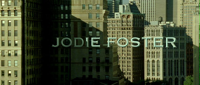
- The colour of the text (Grey) also reflects the urban setting on which the title sequence is based
- The titles seem immovable as if they are part of the environment
- The typography is linked to the narrative on screen but do not interfere, despite the fact that they have similar aspects to the buildings in the frame. The solidness of the typography suggests being locked into something – could relate to the ‘Panic Room’ in the film
- The slow pans around the text create tension as the viewer is slowly revealed more in the shot
- On especially effective pan is the high angle coming down at 1:27
- Useful for our title sequence as we would probably be using stationary lettering, however we would not use them in the same style as in this sequence the typography is the focus of the intro. In our opening the text would merely be on the side – as to not draw viewer away from on screen actions
- There is non-diegetic and diegetic sounds, the music carries a sinister tone – use of orchestral music. Music turns deeper when main title ‘Panic Room’ appears, also plays at a faster pace to create urgency. Diegetic sounds include certain noises from the city e.g. police sirens, gives sense of crime or urgency


No comments:
Post a Comment